
Next.js 16 enabled Turbopack as a default bundler. It is fast, modern, and noticeably improves the DX in many areas.
But when I started adding SVG icons to my project, I realized the common options did not cover my needs:
- I wanted icons to be inlined, so they display instantly without an extra network request.
- I wanted to avoid the SVG-in-JS performance penalty (more on this later).
- I wanted to customize icon color via CSS.
- And everything had to be compatible with Turbopack, not just Webpack.
I tried the popular SVG approaches for Next.js apps: built-in <Image />, SVGR, SVG sprites. They are all well-known and widely used, but none of them fully matched my requirements. Let’s look at why they fall short and how I built a custom Turbopack loader that solved the issue.
Why Existing Approaches Fall Short
Let me quickly show why the most common ways to handle SVGs in Next.js fall short for SVG icons.
1. Next <Image />
Next.js has excellent built-in support for importing SVGs as static images. The usage is straightforward:
import Image from 'next/image';import myIcon from './icon.svg';
export default function Page() {  return <Image src={myIcon} alt="my icon" />;}
The imported myIcon object looks like this:
{ src: "/_next/static/media/icon.682156e7.svg", width: 24, height: 24,}In HTML it appears as <img> tag:

This has two big benefits:
- ✅ Turbopack automatically copies the original SVG to the output directory with a hashed filename, so the file is immutable and cacheable.
- ✅ It also extracts the intrinsic width and height, ensuring proper layout without shifts.
But for icons specifically, this approach has two major drawbacks:
- ❌ It generates a separate HTTP request for every icon, which means your icons may not appear instantly.
- ❌ You can’t change the icon color via CSS, since the SVG isn’t inlined.
Great for logos and large illustrations. Not great for small UI icons.
2. SVGR (@svgr/webpack)
SVGR converts an SVG into a React component. Turbopack supports this loader, and it is a pretty popular pattern:
import Icon from './icon.svg';
export default function Page() {  return <Icon className="text-red-500" />;}
In HTML it inlines SVG content directly into the DOM:

Pros & cons:
- ✅ You can fully customize the icon via CSS.
- ✅ Since the SVG is inlined, it renders instantly.
- ❌ This approach moves the entire SVG markup into your JavaScript bundle. For small icons this may look harmless, but it adds up quickly, especially in apps with dozens or hundreds of icons.
There’s a great deep-dive on this topic: Breaking Up with SVG-in-JS.
In short: extra DOM nodes, extra JS, extra parsing, and none of it is necessary if your SVG is just a static asset.
Due to this performance cost, I stopped using SVGR in my projects.
3. SVG Sprite Maps
Sprite maps combine multiple SVGs into a single <svg> file, and individual icons are referenced with the <use> tag.
Example SVG sprite:
<svg> <symbol id="icon1"> <path d="..." /> </symbol> ...</svg>Usage in JSX:
return <svg><use href="/sprite.svg#icon1" /></svg>;If you want a detailed explanation of the sprite technique, here is a great article: Use svg sprite icons in React.
In the context of Turbopack, the real question is how to generate the sprite effectively. There are two ways:
a) Pre-build script
A script crawls your icon directory and generates one giant sprite.
Pros & cons:
- ✅ Works with any framework or bundler
- ❌ Includes every icon, not just the ones you import
- ❌ Requires an extra script + watcher integration → not ideal DX
b) Loader-based sprite generation
A loader collects only the SVGs you actually import and builds a sprite automatically.
Pros & cons:
- ✅ Only includes used icons
- ❌ Not compatible with Turbopack: currently Turbopack loaders can produce only JavaScript output and do not support
this.emitFile()method (unlike webpack).
Extra issue: Safari doesn’t render sprite icons that contain SVG filters (bug report). I tested this and confirmed the issue on Safari 26.1. Many of my icons rely on filters, so this made sprite maps unusable for me.
Solution: Inline Small SVGs as Data URI
Finally, I ended up looking at another option: what if small SVG icons were just inlined directly as data URIs?
Ideally, the imported SVG would provide the same object as an external image, but with a data URI in src:
import myIcon from './icon.svg';
/*{  src: "data:image/svg+xml,...",  width: 32,  height: 32}*/
For icons, this has a few natural advantages:
- The icon appears instantly.
- The SVG stays as a static asset: no extra DOM nodes, no SVG-in-JS overhead.
- The image’s
widthandheightpreserve the intrinsic size. - Since it behaves like a normal image import, it can be passed to the
<Image />component:
import Image from 'next/image';import myIcon from './icon.svg';
export default function Page() {  return <Image src={myIcon} alt="my icon" />;}
But none of the existing loaders supported this pattern, so I decided to build my own.
Building a Custom Turbopack SVG Loader
The loader should perform three things:
- convert SVG content into a compact data URI
- extract SVG’s intrinsic
widthandheightfor correct default sizing - return these values as an object
{ src, width, height }
The good news is that all of this can be done with a few existing packages:
svgoto optimize the SVG markupmini-svg-data-urito convert it into a very compact data URLimage-sizeto extract intrinsic dimensions (the same library Next.js uses internally)
Because of that, the loader code turned out to be surprisingly small:
// inline-svg-loader.jsconst { optimize } = require("svgo");const svgToMiniDataURI = require("mini-svg-data-uri");const { imageSize } = require("image-size");
module.exports = function (content) {  this.cacheable?.();
  const optimized = optimize(content);  const src = svgToMiniDataURI(optimized.data);  const { width, height } = imageSize(Buffer.from(content));  const result = { src, width, height };
  return `export default ${JSON.stringify(result)};`;};
It uses CommonJS syntax, because Turbopack does not support ESM loaders yet.
Then, I added the loader to my next.config.js so Turbopack applies it to .svg imports:
const nextConfig = {  turbopack: {    rules: {      '*.svg': {        loaders: ['./inline-svg-loader.js'],        as: '*.js',      },    },  },};
export default nextConfig;
Given this setup, my Next.js project correctly displayed checkmark SVG icon inlined into the <img> tag:


Full data URI is collapsed by the devtools.
However, there are two problems that still need to be resolved:
- Now every SVG is inlined, including large images.
- How to change the color of the inlined SVG?
Problem 1: Conditional Inlining
Ideally, I wanted a setup where:
- small SVGs are inlined as data URIs
- large SVGs fall back to the built-in Next.js behavior
- both produce the same
{src, width, height}object compatible with<Image />component
Fortunately, Next.js 16 shipped exactly what I need: Turbopack condition rules. These rules allow loaders to conditionally apply only to files matching different criteria.
The key part is the content condition, which checks the entire file body. Since it accepts a RegExp, it’s possible to match files by approximate size. For example, this pattern matches files up to around 4 Kb:
/^[\s\S]{0,4000}$/It uses
[\s\S]to match any character including newlines.
Using this, I updated the Turbopack configuration to only apply the inline loader to small SVGs:
const nextConfig = {  turbopack: {    rules: {      '*.svg': {        loaders: ['./inline-svg-loader.js'],        condition: {          content: /^[\s\S]{0,4000}$/, // Inline SVGs smaller than ~4Kb        },        as: '*.js',      },    },  },};
export default nextConfig;
To illustrate conditional inlining, I created a page with two SVG images:
- a checkmark icon (436 bytes)
- new W3C logo (42 Kb)
Next.js correctly renders both images: the first one is inlined and the second is external:


A nice use-case for Turbopack’s built-in capabilities!
Hopefully, Turbopack will add a dedicated condition for
filesizein the future. I’ve opened a feature request for that in the Next.js repo.
Problem 2: Customizing Icon Color
The approach to coloring an SVG depends on how much customization you need. If you want to style different parts of the SVG independently, it must be rendered as DOM nodes anyway. But most of my icons are monochrome, and the only requirement is setting a single color via CSS. For this case, there is a clean workaround: CSS masking.
Instead of modifying the SVG itself, the color is set to the element’s background and the SVG defines the visible shape:
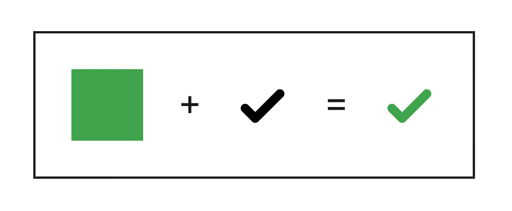
The result is a fully color-customizable icon that still behaves like a regular image asset.
The masking setup:
- render the
<img>tag withsrcset to an empty image - set
widthandheightattributes to the intrinsic values for SVG - set the CSS
maskproperty to the actual icon data URI - set
background-color: currentcolorto make the icon color customizable
I wrapped it into the universal Icon.tsx component:
/** * A component for rendering mono-color SVG icons using the current text color. */import { type ComponentProps } from 'react';import { type StaticImageData } from 'next/image';
type IconProps = Omit<ComponentProps<'img'>, 'src'> & {  src: StaticImageData;};
const EMPTY_SVG = `data:image/svg+xml,%3Csvg xmlns='http://www.w3.org/2000/svg'/%3E`;
export default function Icon({ src, width, height, style, ...props }: IconProps) {  return (    <img      width={width ?? src.width}      height={height ?? src.height}      src={EMPTY_SVG}      style={{        ...style,        backgroundColor: 'currentcolor',        mask: `url("${src.src}") no-repeat center / contain`,      }}      {...props}    />  );}
With this setup, customizing the icon color becomes as simple as writing normal CSS:
import Icon from './Icon';import myIcon from './icon.svg';
// Set color with stylereturn <Icon src={myIcon} style={{ color: 'red' }} />;
// Set color with Tailwindreturn <Icon src={myIcon} className="text-green-600" />;
// Set both size and colorreturn <Icon src={myIcon} width={64} height={64} className="text-blue-600" />;
Output:
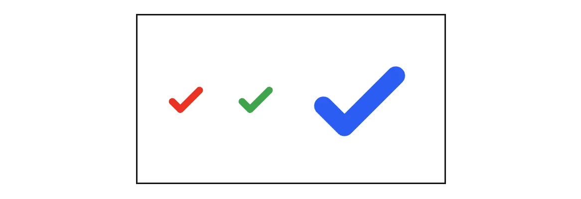
This method works well for any single-color SVG icon. Multi-color icons could still be rendered normally with <Image /> component.
Packaging the Loader
Although the inline loader is only a few lines of code, I quickly found myself wanting to reuse it in multiple projects. Instead of copying the file around, I built a small npm package that includes all required dependencies and works directly with Turbopack’s configuration rules.
The package lives here: turbopack-inline-svg-loader
You can install it and pass the loader name to the Turbopack configuration:
const nextConfig = {  turbopack: {    rules: {      '*.svg': {        loaders: ['turbopack-inline-svg-loader'],        condition: {          content: /^[\s\S]{0,4000}$/, // Inline SVGs smaller than ~4Kb        },        as: '*.js',      },    },  },};
export default nextConfig;
This keeps the project setup clean and allows the loader to be shared and updated like any other dependency.
Conclusion
The combination of a custom loader, Turbopack’s condition rules and CSS masking provided a flexible SVG workflow in my Next.js projects:
- small icons are inlined and render instantly.
- larger SVGs fallback to the default Next.js loader and remain external.
- both imports work seamlessly with the
<Image />component. - monochrome icons can be styled via CSS.
For use cases requiring deeper control of SVG internals, SVGR or inlined markup is still the right choice. But for many other projects, I believe this approach should be a practical and efficient alternative. Feel free to share your feedback!